ubbink presents a new brand appearance that reflects the simplicity of the product. Through ubbink’s unique click system, the installation is as easy as playing with Lego. No special tools or similar are needed anymore. My design-oriented and systematic approach led to an expressive, simplified brand presence. The focus is on the simplification benefit and the harmonization of the sub-brands.
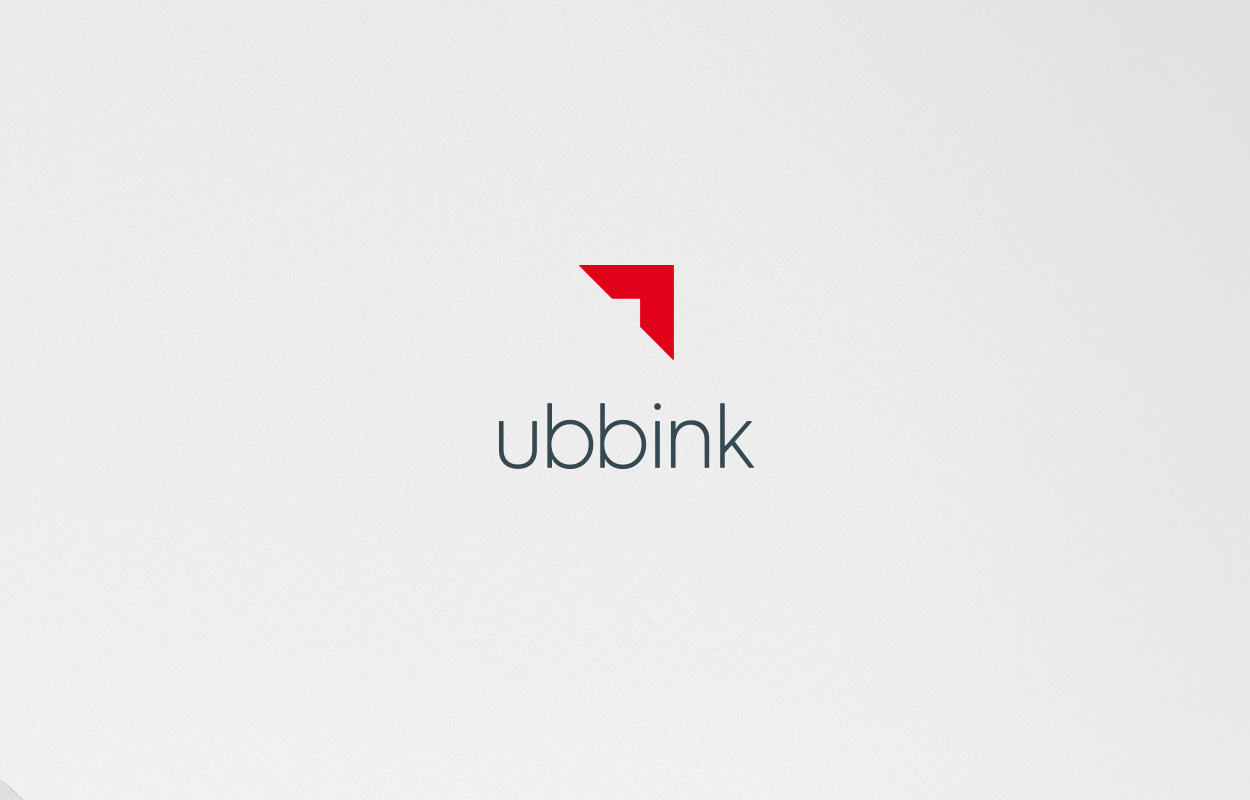
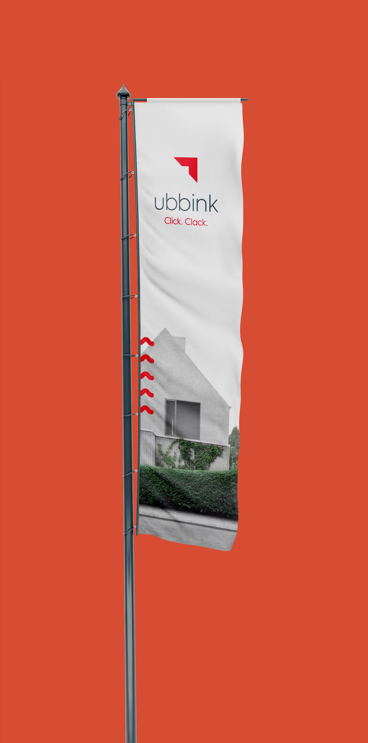
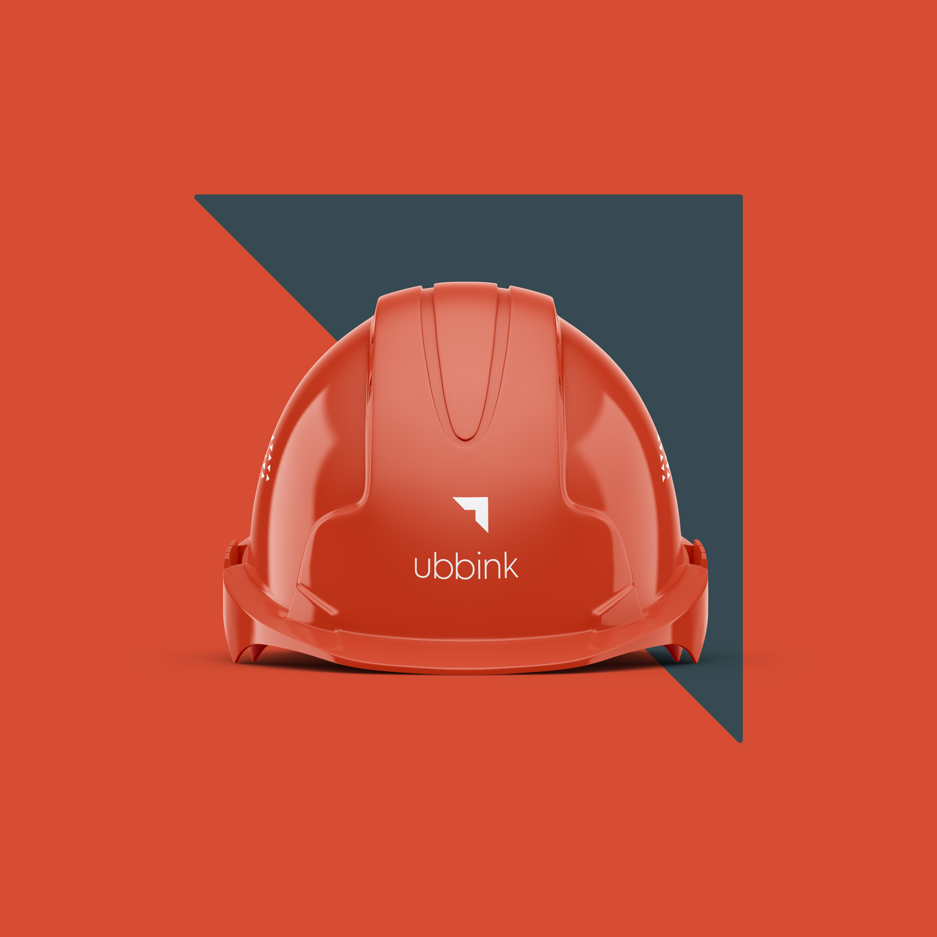
During the brand relaunch, it was essential not to drastically alter the brand symbol. By the logo design into a simplifying roof, I was able to create a modernized logo for the ubbink brand that is suitable for all applications.


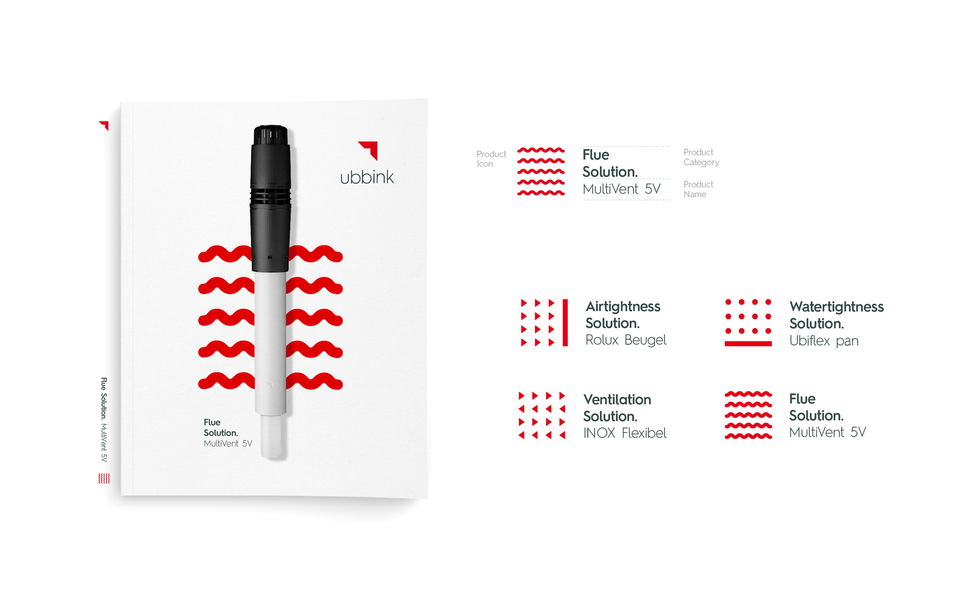
The ubbink product portfolio is divided into four product categories. In order to achieve better visual differentiation and orientation for the products, I have developed a unique symbol for each, which illustrates the benefit of the respective category.


Colors are a crucial component of a company’s Corporate Identity. They can help differentiate a brand and make it distinct.