Slim’s portfolio has 3 product categories: Shape, Mass, and Vitamins. Their clever formula promises visible results in just 2 weeks without the yo-yo effect - a Black Magic Nutrition. The challenge was to create a simple and modern package that stands out on the shelf and communicates the promise.


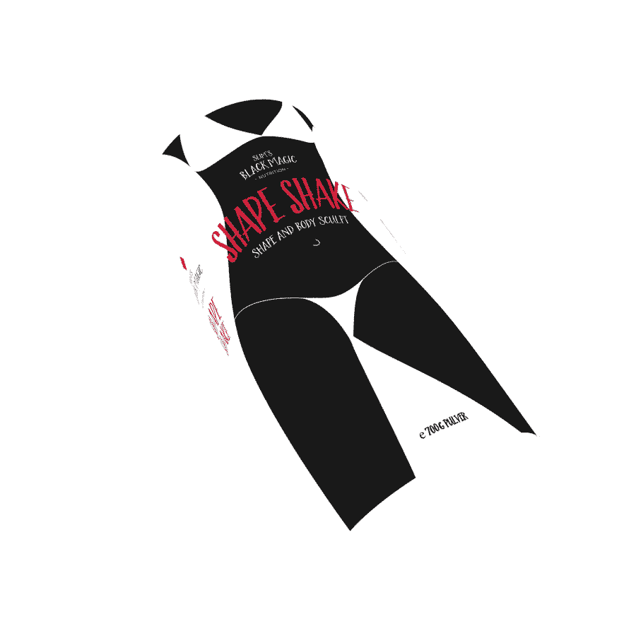


The packaging design of the „Shape“ product line plays with female silhouettes. However, we did not want to create an ideal image, but rather visualize for consumers their goal, such as a bikini figure or a healthy and dynamic body.


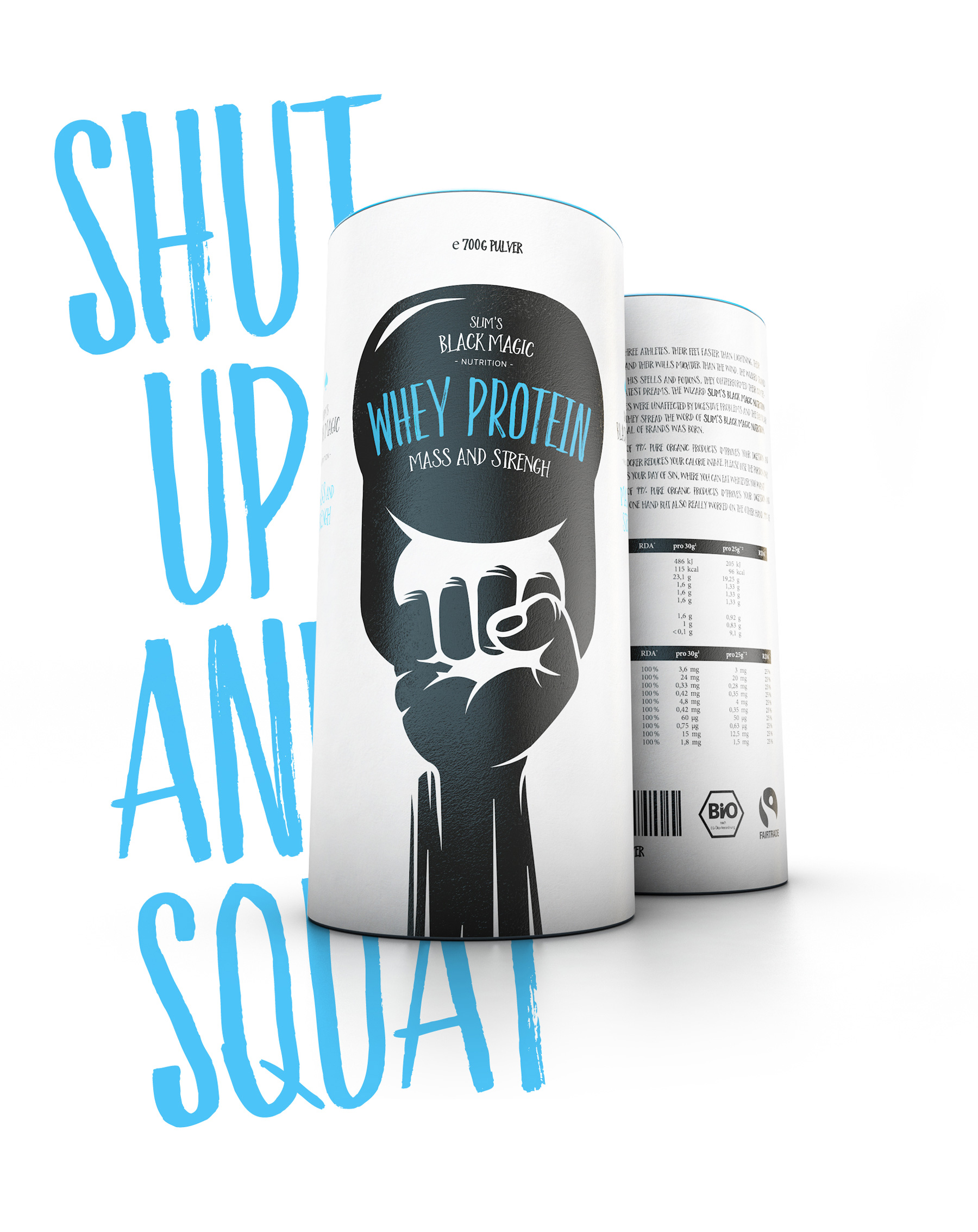


The packaging design of the „Mass“ product line features strength symbols. We don’t want to fool the consumer into thinking that a shake is enough to steel his body. It remains a sweaty act, but it definitely goes faster with our "Mass" products.


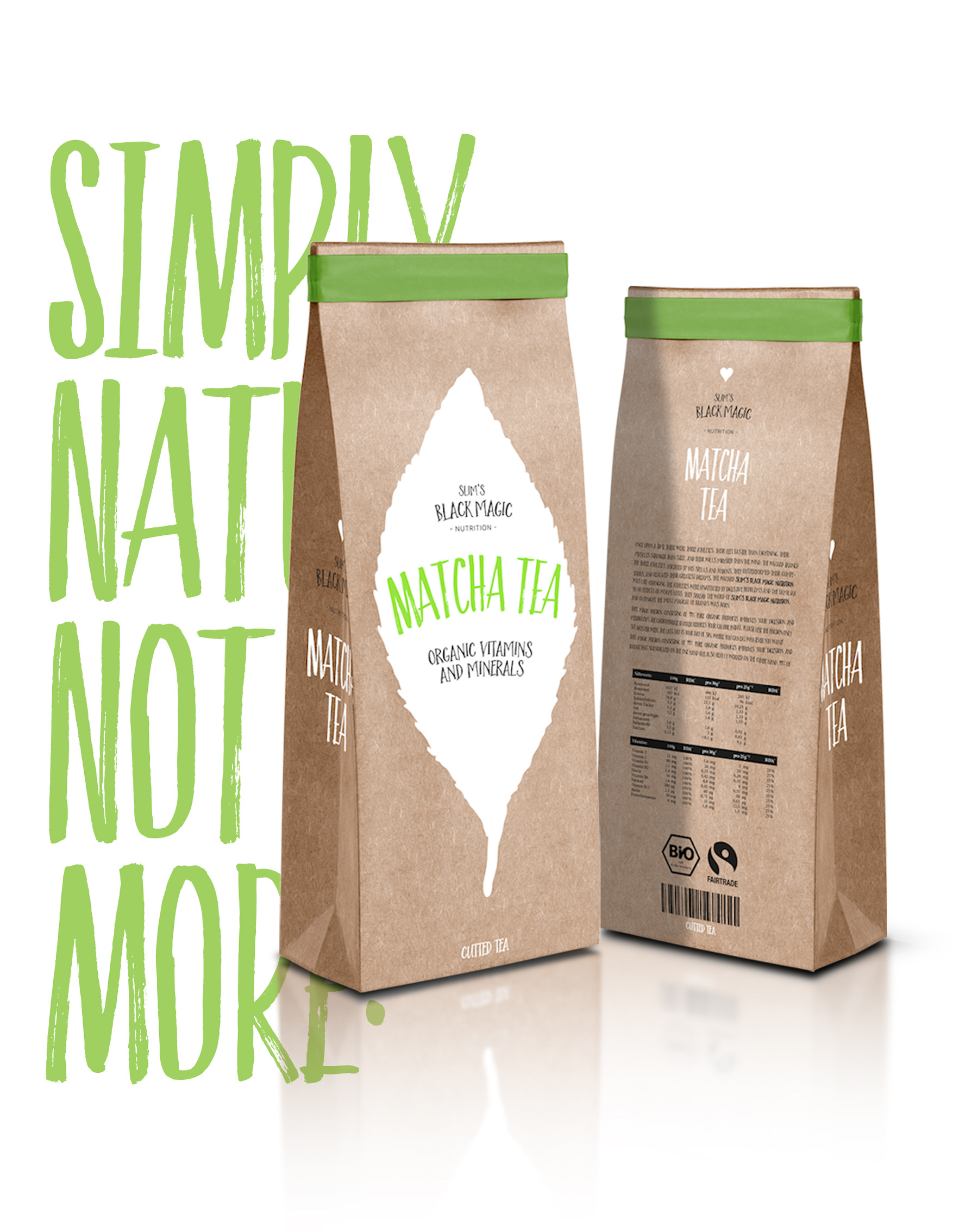


The packaging design of the „Vitamins“ product line shows the silhouettes of the ingredients. Because with vitamins, it’s all about their healthy content.